Intuit’s Help Entry Redesign
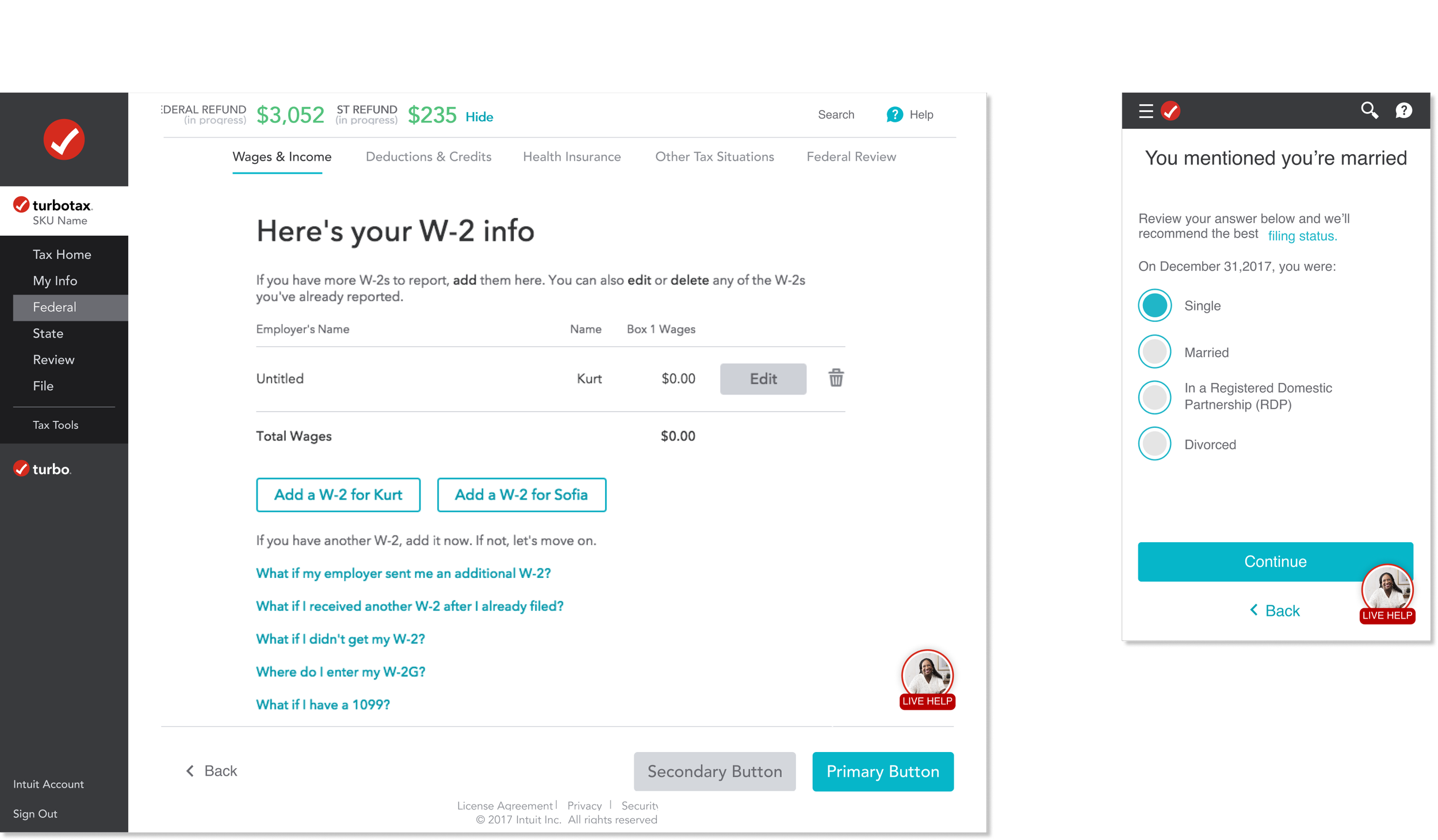
At Intuit, easy access to help is crucial for customer satisfaction and platform success. We created a Help Entry Interaction Button that seamlessly fits within TurboTax and TurboTax Live while being user-friendly for all devices and users.
Tools
Figma
Miro
Jira
UserTesting.com
Deliverables
Stakeholder Interviews
Competitive analysis
Visual explorations
Mockups and prototypes
Final design specs and visual asset
My Role
Visual Product Design Lead
Duration
6 MONTHS
Team
Visual Product Design
TurboTax
Challenge
As part of our mission to empower users with the tools they need, we set out to enhance how users access help within TurboTax and TurboTax Live. The goal was clear: create a Help Entry Interaction Button that is intuitive, accessible across devices, and seamlessly integrated into the platform.
However, the challenge lay in balancing design simplicity with functionality. The button needed to work across both TurboTax’s DIY version and the expert-driven TurboTax Live while maintaining consistency with Intuit’s design system.
Analyzing User Needs
To ensure the button was truly user-friendly, we explored several use cases. We focused on how users interacted with the help feature, especially those new to TurboTax, and how different service levels affected the user journey. By considering these various touchpoints, we were able to design an experience that provided the right amount of assistance without being intrusive.
The Approach
At Intuit, I was tasked with designing a Help Entry Interaction Button for the TurboTax platform, requiring close collaboration with the TurboTax and the IDS (Intuit Design System) teams. This project required a blend of my skills in visual design, design systems implementation, and rapid prototyping.
Concepts
Visual Exploration
Visual Treatment
A Floating
Call-to-Action
Our final solution was a floating call-to-action button, anchored at the bottom of the screen. It followed users as they scrolled, ensuring visibility without disrupting their workflow. This approach struck the perfect balance between accessibility and subtlety, allowing users to easily access help when needed while keeping the focus on the task at hand.
Core Principles
We anchored our design on three core principles: discoverability, clarity, and a humanized approach to communication. We wanted users to effortlessly find the help they needed, regardless of whether they were first-time filers or seasoned users upgrading to TurboTax Live. The design had to adapt fluidly across mobile devices and support different service levels without overwhelming the user interface.


